

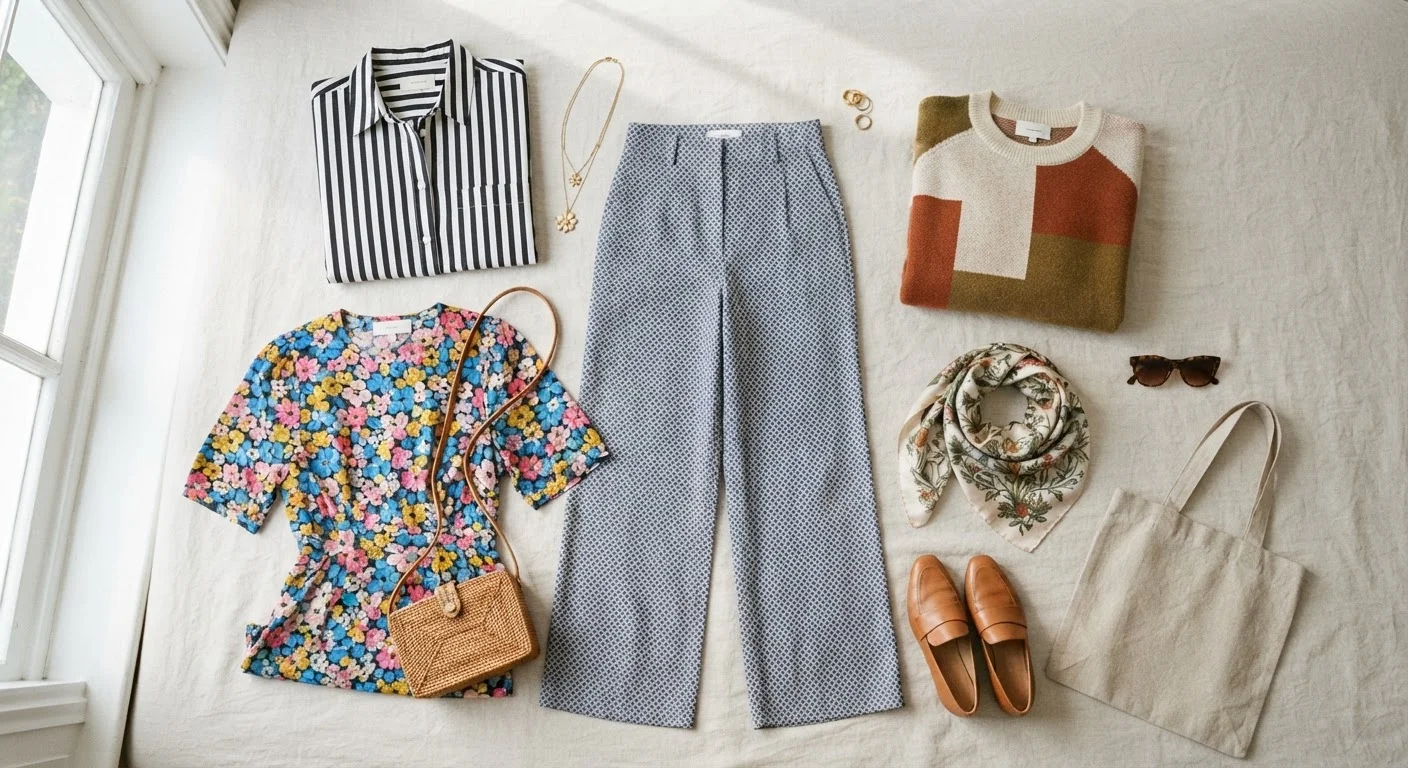
Key Takeaways
Pattern Mixing
Pattern mixing is the practice of wearing two or more distinct prints in a single outfit — such as pairing stripes with florals or plaids with polka dots. When done thoughtfully, it creates visual interest and personality. The key is applying a few consistent principles so the combination reads as deliberate rather than accidental.
In fashion theory, successful pattern mixing typically relies on scale contrast (one large-scale print paired with a smaller one) and a shared color anchor — at least one color that appears in both prints — to create visual cohesion.
Why Pattern Mixing Feels Risky — and Why It Doesn't Have to Be
For a lot of people, mixing prints feels like an advanced move best left to stylists and fashion insiders. In reality, the discomfort usually comes from not having a framework — not from any actual rule that says prints must stay apart. Once you understand what makes combinations work, the process becomes far less intimidating.
Most outfit coordination problems come down to a few repeating issues. If you've ever put on what seemed like a good combination and still felt something was off, this breakdown of common coordination errors can help you pinpoint the real culprit. Pattern mixing follows the same underlying logic: proportion, balance, and a shared visual thread.
Start With What You Already Own
Before buying anything new, lay out your existing printed pieces and look for color overlaps between them. You likely already own combinations that work — you just haven't tried them yet. A shared accent color, even a minor one, is usually enough to anchor a pairing.
The Three Principles That Make Mixed Prints Work
There's no single rule that governs every successful mixed-print outfit, but three principles apply consistently across almost every good combination.
1. Scale Contrast
The most reliable tool in pattern mixing is varying the size of your prints. Pair a large, bold pattern — a wide floral or an oversized plaid — with a much smaller one, like a fine stripe or a tiny dot. When both prints compete at the same visual scale, the eye has nowhere to settle. When they differ in size, one naturally becomes the focal point and the other supports it.
2. A Shared Color Anchor
Look for at least one color that appears in both prints. It doesn't have to be the dominant color in either — even a secondary tone that repeats across patterns creates enough visual connection to make the combination feel intentional. This is why a navy stripe and a floral with navy accents will almost always work together.
3. A Solid Separator or Anchor Piece
A neutral solid — a belt, a blazer, a shoe, or even a bag — gives the eye a moment to breathe between two competing prints. It doesn't need to be large; it just needs to be present. Understanding how neutrals function in an outfit will make this step much easier to execute.
2:1
Ideal print-to-solid ratio for beginners
Style educators commonly recommend anchoring mixed-print outfits with at least one solid piece for every two patterned pieces to maintain visual balance.
3x
More outfit combinations from pattern pieces
Fashion educators note that understanding pattern mixing can roughly triple the number of workable combinations a person can create from the same wardrobe.
Pattern Families: Which Prints Play Well Together
Not all print combinations require equal effort. Some pattern types have a natural affinity because of their geometry, line structure, or cultural pairing history.
- Stripes + florals: A timeless pairing. The rigid linearity of stripes balances the organic curves of florals. Keep the scale contrast clear.
- Geometric + organic: Triangles or checks paired with watercolor-style prints create an interesting tension that usually resolves well if the color palette is tight.
- Two geometrics: A plaid and a stripe, for instance, can work if they share a color and differ in scale — but this combination requires the most precision to avoid visual noise.
- Texture-based prints: Animal prints — leopard, snake, zebra — behave more like neutrals than bold patterns, which is why they pair surprisingly well with geometric and floral prints alike.
Pattern mixing also opens up possibilities when rotating seasonal pieces — a floral from spring can carry into fall when paired with a plaid or rich-toned stripe.
Putting It Into Practice
The most practical approach is to build from one anchor print you already own and love. Choose something that has at least two colors in it — that color range will guide your second pattern pick. Then apply the scale rule: if your anchor piece is bold and large-scale, reach for something finer and more restrained as the second print.
From there, the finishing details — shoe condition, fit through the shoulders, how your pieces are pressed — will do as much for the final impression as the print combination itself. Pattern mixing rewards confidence: wear the combination as though it was always the plan, and it almost always reads that way.
“Fashion is about dressing according to what's fashionable. Style is more about being yourself. The goal of mixing prints isn't to follow a formula — it's to express something intentional.”
— Tim Gunn, Fashion educator, author, and television personality