

Key Takeaways
Grocery Store Layout
Grocery store layout refers to the deliberate arrangement of departments, aisles, shelves, and displays to guide shopper movement and influence purchasing decisions. Retailers use principles from retail psychology and environmental design to maximize the time shoppers spend in the store and the number of items they place in their carts. It's not accidental - every element from entrance placement to checkout lane merchandise is planned.
Retailers often use planograms - visual diagrams specifying the exact placement of every product on every shelf - combined with foot-traffic heat maps and purchase data to continuously optimize store layouts.
The Store Is a Designed Environment
Walking into a grocery store can feel casual and routine, but the environment around you has been engineered down to the square foot. From the moment you enter, the layout is working to extend your visit, broaden your path, and expand your cart.
Produce is almost always near the entrance - not because it's convenient to stock, but because fresh, colorful fruits and vegetables create a positive first impression and put shoppers in a receptive, even generous, mindset. This is a studied effect, not a coincidence.
Understanding the logic behind store design doesn't require a retail degree. It just takes a few minutes of awareness - and once you see it, you can't unsee it. Shoppers who recognize these patterns tend to spend less on unplanned items without feeling deprived.
Store Layouts Vary, but the Logic Doesn't
No two stores are laid out identically, and large chains sometimes vary layouts by region or store size. However, the underlying behavioral principles - placing staples at the back, premium products at eye level, and impulse items at checkout - are broadly consistent across the grocery retail industry. Once you recognize the pattern in one store, it transfers almost everywhere.
The Key Layout Principles Retailers Use
Several consistent design strategies appear across most major grocery chains:
- Perimeter placement of staples: Dairy, meat, and eggs are nearly always along the back or outer walls. To reach them, you pass hundreds of other products.
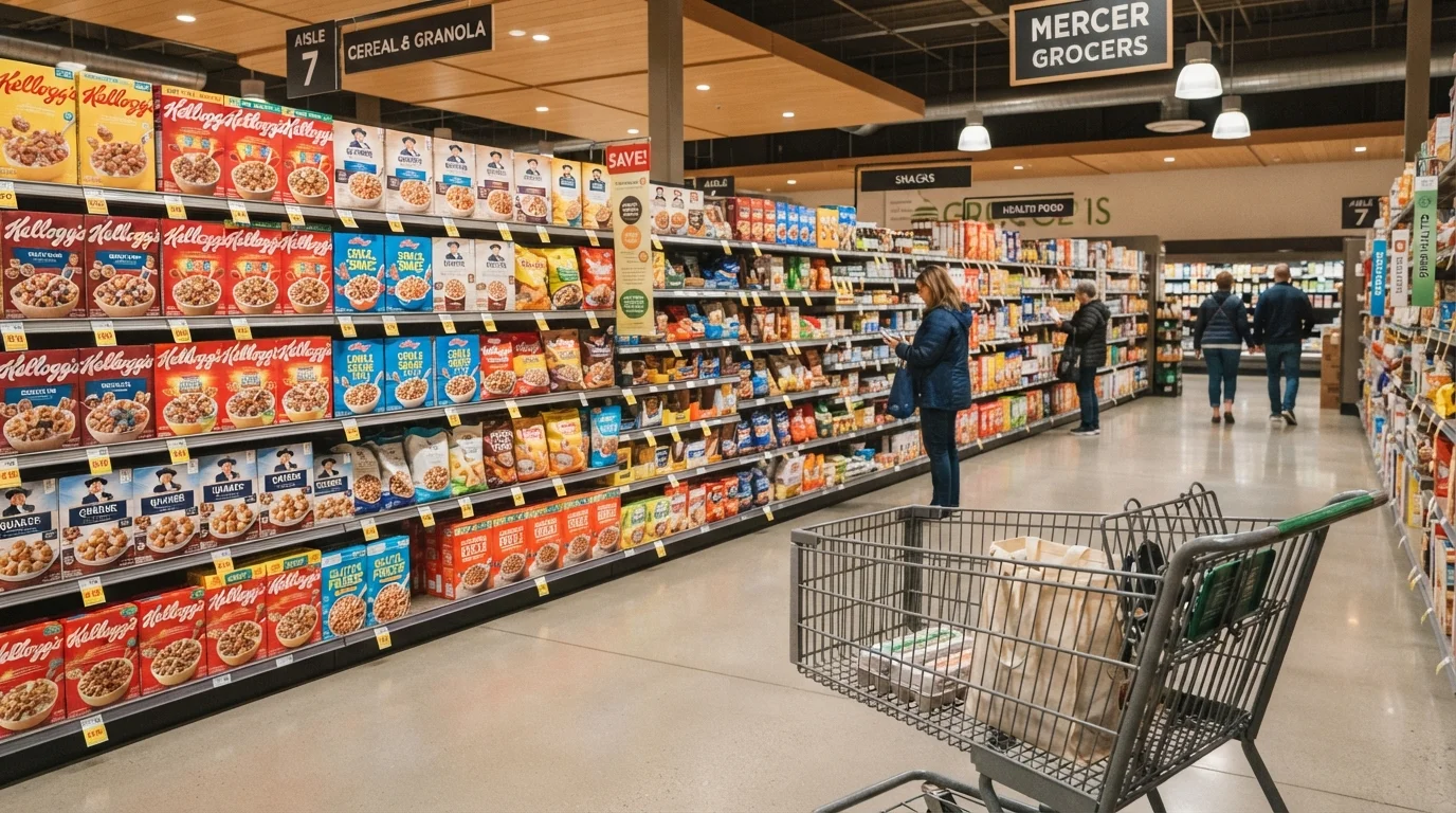
- Eye-level shelf positioning: Products manufacturers pay for prime shelf space sit at eye level - typically between waist and shoulder height - because that's where shoppers look first and longest. Budget and store-brand alternatives often sit on lower shelves.
- End-cap displays: The shelving at the end of each aisle carries products the store wants to move. Shoppers frequently assume these items are discounted, but that's not always the case. Check the unit price before assuming you're getting a deal.
- The decompression zone: The first few feet inside the entrance are a transition space where shoppers slow down and take in their surroundings. Retailers typically avoid placing high-priority items here because attention is still orienting.
- Checkout lane merchandise: Small, low-cost items line the checkout lanes precisely because you're stationary and waiting. This is one of the most effective zones for triggering impulse purchases.
~70%
Grocery purchases that are unplanned
Retail industry research has consistently found that a large majority of in-store grocery purchases were not on the shopper's original list before entering the store.
Eye level
Shelf position driving the most sales
Retail analysts widely document that products at eye level significantly outsell those on lower or higher shelves, which is why manufacturers pay slotting fees for that positioning.
Slower tempo
Music style linked to longer store visits
Studies in retail consumer behavior have found slower background music correlates with longer average time spent in the store and higher average transaction value.
Sensory Cues That Reinforce the Environment
Layout is only part of the picture. Grocery stores also use ambient elements to shape your experience and behavior:
Music tempo: Consumer behavior research has documented that slower background music tends to reduce the pace at which shoppers move, resulting in longer store visits and, on average, higher spend per trip.
Scent: The smell of fresh-baked bread or roasting chicken is sometimes pumped from dedicated areas to stimulate appetite and create a sense of warmth and abundance. A hungry shopper, research suggests, tends to purchase more.
Lighting: Produce and bakery sections often use warmer, more flattering lighting to make food look fresher and more appealing. Cooler, brighter light is used in areas where clarity and hygiene are priorities.
None of this is inherently deceptive - but being aware of these cues can help you stay grounded in what you actually came to buy. If you're building a tighter monthly budget, understanding this environment is a useful complement to core budgeting habits.
How to Navigate on Your Own Terms
You don't need to avoid grocery stores or treat every aisle as a trap. A few practical habits can significantly reduce layout-driven spending:
- Bring a specific list: A well-structured shopping list is one of the most reliable tools for staying on budget. Organize it by store section to reduce backtracking and browsing.
- Shop the shelves vertically: Before putting something in your cart, glance at the shelves above and below eye level. Lower shelves often carry equivalent products at lower prices.
- Treat end-caps with skepticism: Always compare the unit price on an end-cap item with the same product shelved in its regular aisle location. The price difference may surprise you.
- Eat before you shop: Shopping while hungry amplifies the effect of scent and visual cues, and tends to result in more unplanned purchases.
- Use a basket for small trips: A cart invites filling. For short trips, a handheld basket is a natural limiter.
If you're weighing whether to shop in-store at all for certain categories, a comparison of in-store and online shopping can help you decide where each approach serves you better.
Check the Unit Price, Not Just the Sticker
Most grocery store shelves display a unit price (price per ounce, per count, etc.) on the shelf tag below the item. This single number levels the playing field across different package sizes, brands, and promotional displays. Making it a habit to scan the unit price before choosing takes only seconds and often reveals better value a shelf level away.